Monday, 31 October 2016
Sunday, 30 October 2016


Saturday, 29 October 2016


Friday, 28 October 2016
Thursday, 27 October 2016
Wednesday, 26 October 2016


Tuesday, 25 October 2016
Directors' Influences
For our music video, we have pulled from a range of music videos and directors to create an original idea.

The main narrative is inspired by Jonas Brothers' "Burnin Up" which has three distinct imaginary scenarios. We plan to do something very similar. However, their video takes a more humour turn, shown through editing and costume.

In ours, we plan to stick to the central theme. In this way our video is more like Ne-Yo's "Miss Independent" in that apart from the love story, there isn't many other plot lines.
I would also like to incorporate Sofia Coppola's directing style into our video. While this won't be through the costume or narrative, I hope to use editing to showcase the serious and dreamlike atmosphere that is distinctive to her.


Monday, 24 October 2016
Technical run through of Lyrics

"I just want to be a better man." Lyrics could suggest that a story is about to be told.
"What can I do? What can I do?" Lyrics shows that the artist has possibly done wrong by someone.
"To get back to your heart." The lyrics prove the theory that the artist has done someone wrong and is now trying to make it 'better'
"If you would give me another start girl." Lyrics suggest that he could've been dumped and is now trying to win her back.
Lyric Timeline
 |
| Time stamps on the right, general important info on the left |
 |
| The verses that need to be lip-synched |
These are the initial plans for the timeline of the music video in correspondence with the lyrics. Ideally, I would want the events in the music video to fit in with lyrics on a line-by-line basis but that may have been a little extreme. In my research, I have noticed that the music video does tend to have the same general theme as the lyrics but often does not match exactly the lyrics on such a close level.
The other slight issue is that our third location has a separate arc too and it needs time to fulfil that. I have put down for the third location to come in at a line that is perhaps too intense an introductory shot and so on which may slow the video down and make it seem bogged down. However, this is a general timeline and we may change when that particular scene comes in. The priority still is as before - to tell that story inside the bigger narrative.
Sunday, 23 October 2016
Location Scouting
 Location 1
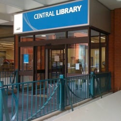
As our music video follows a narrative, the decision to have our first location in a library was based on this. I thought that this was a good idea because its a place where we are able to quickly access. Also, it fits the narrative. We had to chose between a library or a coffee shop and it was decided that there would be less people in the way when filming in a library compared to a coffee shop. This was also because we were given permission to film in the library whereas the coffee shop had yet to respond.
 Location 2
For this location, we were able to film in the museum. It was decided that we use this location, this is because the museum would make the scene look like they're on a date when
it is being imagined. In using this scene, we also found that we could effectively film scenes where they're together. The scenes that we'll film will make the video seem more real.
 Location 3
Using a park as one of our locations is because this will be a scene where they're on another date in a different location. Using a park would be easier to use as we'll be able to film freely. However their could be a lot of people walk around which does increase the risks. For example people may trip over the equipment. Overall this is a good place to film as it will also fit into the narrative.
Saturday, 22 October 2016

Friday, 21 October 2016
Logo
 Making a logo was quite simple, because my idea for the logo was so simple in itself. I wanted some minimal art, accompanied by the name as is necessary. I chose the simple art of a record and picked red for the colour. This is because i personally associate soul music with warm colours and thought this would be most appropriate. I then decided that the dark colour I had originally chosen, just for simplicity's sake, was not meshing well with the art. Then I decided to change the colour of the text to the other extreme - white. Although it's not clear here, the background is transparent and in my opinion, looks quite similar to professional logos.
Thursday, 20 October 2016

Subscribe to:
Comments (Atom)
Welcome Post
Dear Moderator, Welcome to our blog. We created an artist called Ritik Vala for the genre of R&B and Soul. We created two differe...

-
 This is my final digipak. There is a theme running through it, the outer areas are darker, and the inner areas are brighter. This matches th...
 -
 Please link the link below to view my website https://northwestrecords12.wixsite.com/ritikvala
